Why social tables remain the coolest tool for historical inequality studies
Studying economic inequality in contemporary settings remains a difficult thing to do. People are typically not too keen on letting you know how much they earn or how rich they are. We often under-report our earnings for fear of rebuke from tax authorities or because it’s a social taboo to speak about money and incomes. So modern economists are left with survey data that may either underestimate or overestimate inequality metrics. But despite these challenges the overall picture we get from many of these studies is more or less accurate. Now imagine looking at long-term inequality where the data situation is so much worse. Researchers busing themselves with historical inequality studies really have their work cut out for them considering that their data is often both difficult to retrieve and of questionable quality.
Therefore, writing a blog post about a meta-study on social table use in economic history research is challenging because one is torn between a feeling of genuine commitment to the rigour of academic discourse, on the one hand, and the show of respect to academic peers that often have spent years constructing these magical data grouping tools, on the other hand. Nevertheless, together with Dieter von Fintel (Stellenbosch University) and Erik Green (Lund University), I have worked on investigating the empirical soundness of the social tables approach for calculating historical income inequality.
We believe that data grouping in inequality studies have been useful in measuring income or wealth inequality for populations where information is scarce. In contemporary economics it is often deployed to comment on incomes for countries where large informal sectors are present, and data is scarce. This is exactly why it is so appealing for the historical settings, where micro-level income or wealth information is limited at best. Social tables essentially group a population into classes, to which a well-researched mean income is assigned and a between group income/wealth inequality number can be calculated. Based on this inference, we looked at a large sample of historical social tables used in the global economic inequality discourse fired up by Branco Milanovic in the early-2000s – with some inspiration from twentieth century Kuznets.
Before I venture into the mechanics of how our study is set up, it is important to say that our concern began with skepticism related to low inequality estimates for large populations where classes were few. Since Modalsli (2015) had beaten us to the punch with commenting on overlapping incomes between various classes, we decidedly shifted our focus. But, putting together this database of inequality studies would prove to be daunting, and while we are now finalising our paper, our efforts stretch as far back as 2018. I think part of the difficulty in collecting the data may have been due to our fellow economic historian’s initial skepticism to us writing a commission of inquiry type paper.
As good investigators do for an inquiry, we set out to build a comprehensive database for social tables that was current and detailed – only then could we really say anything meaningful. Some detective work and wonderful co-operation from UC Davis’ Global Price and Income History group has enabled us to construct a dataset spanning more than a thousand years and including 108 individual social tables. In a similar fashion to Milanovic, we survey these social tables which were set-up in meticulous ways by scholars from all over the world for places like England and Wales in 1688, China in 1880, France in 1788 and the Kingdom of Naples in 1811. Beyond looking at mostly Europe, North America and Asia we also expand our dataset to improve the representativity of Africa and South America. While Milanovic did include two African countries and three South American nations in his 2018 paper, we have upped the ante as we also included studies by AFLIT researchers for countries like Botswana and Ghana that have inequality observations for more than one year. Our dataset also contains information on the specific country, gdp per capita, gini-coefficients, population shares attributed to the various classes, and the years for which calculations were done. By incorporating more information for countries of the Global South we get a fuller picture of the computing power of social tables and extend Milanovic’s 2018 analysis of just 41 social tables.
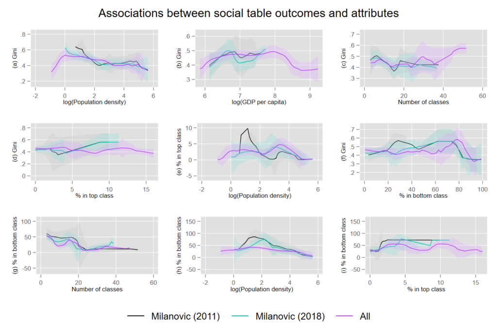
So, what exactly were the findings of our inquiry? Initially, we expected that precisely because many countries in Asia, such as Bihar India or China, had so few classes, their gini-coefficients had been under-estimated. Also, we thought that deliberate research interventions to create more variation in the data by creating more classes would bias the calculated gini coefficients. Our results presented in Figure 1 shows that the association between social table attributes such as the number of classes and the percentage of the population in the top class matters for the eventual gini coefficients calculated. This is especially evident if you look at earlier meta-studies on social tables (Milanovic 2011) versus our own database with ‘all’ available social tables. At a first glance this may have confirmed our expectations, but it turns out that the number of classes is not the most significant determinant of bias in the gini coefficients obtained from social tables. Instead, our multivariate regression analysis shows that one must be cautious of large bottom classes in small populations, meaning countries with populations smaller than two million. This often leads to the bottom class pulling up the eventual inequality estimate. However, we infer that this bias in existing gini coefficient estimates does not come from researcher interventions but rather stems from a lack of data availability.
On the upside, we believe that the piece-de-resistance among social tables studies has been the work done by researchers in the AFLIT network. Hence the relevance of this blog post. We generally find that their social tables for Africa tend to be of better quality and more rigorous in their methodology as they show much more attention to issues like sufficient variation in the data and present observations for more years. This is an improvement compared to studies that often only give one point estimate of a gini for a specific year. They are also much easier to compare across time and space.
In the end, I think the way forward for scholars of long-term inequality trends is pretty straight forward and intuitive, although I have three recommendations. When building social tables, make sure you have enough information that accurately reflects the structure of an economy and gives sufficient variation in the number of classes. Thereby you don’t end up having a problematic bottom class. Another thing may be to introduce a range estimate for incomes in your specific class as opposed to a restrictive point estimate. This could help in dealing with the overlapping classes problem. Third, try to have more than one estimate for one year in any study. Having a time trend often allows one to sense check your findings. But ultimately, the social tables approach has performed reasonably well in giving us a sense of historical inequality.
References
Milanovic, B. (2011). A short history of global inequality: The past two centuries. Explorations in Economic History, 48(4), 494-506.
Milanovic, B. (2018). Towards an explanation of inequality in premodern societies: The role of colonies, urbanization, and high population density. The Economic History Review, 71(4), 1029-1047.
Modalsli, J. (2015). Inequality in the very long run: Inferring inequality from data on social groups. The Journal of Economic Inequality, 13(2), 225–247